A la rencontre d'Hélène, une experte dans l'art de la colorimétrie
.jpg)
Vivez la vie en couleur !
Jaune safran, rose de Jaipur, bleu du dieu Krishna. Les couleurs occupent une place centrale dans la culture indienne, des épices aux traditions, en passant par les vêtements, bijoux et décorations. En 2025, explorez la magie des couleurs avec nous au cœur du Rajasthan, en association avec notre amie Hélène, experte dans l'art de la colorimétrie.
05-06 mars : Une nuit à Delhi
Arrivée à Delhi. Départ pour Bikaner le lendemain.
06-08 mars : 2 nuits à Bikaner
Explorez l’histoire et la symbolique des couleurs avec Hélène, et laissez-vous éblouir par les fresques du fort de Bikaner en compagnie d’Usha. Au programme : une masterclass sur l’histoire et la symbolique des couleurs, en collaboration avec Nos Renaissances et Jamini. Visite exclusive de l'atelier de Shiv Swami, maître reconnu de la peinture miniature, où vous découvrirez l'art complexe et coloré des miniatures indiennes.
08-10 mars : 2 nuits à Mandawa
Apprenez à comprendre les couleurs et leurs multiples dimensions, puis mettez en pratique vos nouvelles connaissances à travers la peinture. Participez à une masterclass en théorie des couleurs avec Hélène pour explorer les nuances et harmonies colorées.
Découvrez ensuite la région du Shekhawati, ses havelis magnifiquement décorés, véritables palais ornés de fresques colorées, contrastant avec le paysage semi-désertique. La rivalité artistique des anciens seigneurs de la région a fait du Shekhawati une galerie d’art à ciel ouvert. Atelier pratique de peinture de nuanciers guidé par Hélène.
10-13 mars : 3 nuits à Jaipur
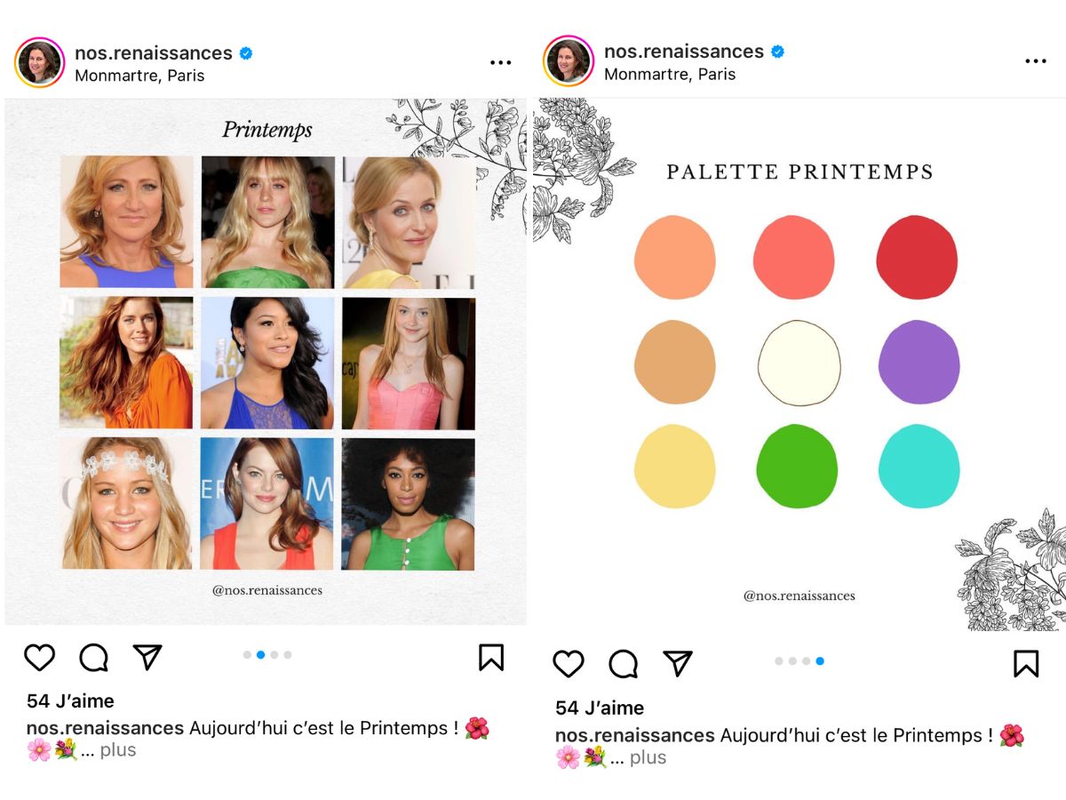
Identifiez les couleurs qui vous correspondent le mieux et apprenez comment elles sont utilisées dans l’artisanat indien. Chaque participante bénéficiera d’un test colorimétrique personnalisé, basé sur les quatre saisons, avec remise d’un nuancier imprimé réalisé par Hélène.
Visitez un atelier d’impression au block print traditionnel, et découvrez les étapes de création d’une collection Jamini en compagnie d’Usha. Explorez également un atelier de bijoux où Usha vous dévoilera la symbolique des pierres précieuses. Enfin, profitez des magnifiques palais, des bazars colorés et du marché des fleurs de Jaipur.
13-15 mars : 2 nuits à Delhi
Célébrez Holi, la fête des couleurs, aux côtés d’Usha et de ses proches. Profitez également d’une séance de shopping pour compléter ce séjour en beauté.
Pour plus d'informations et réservations, contactez-nous à : jamini.paris@gmail.com
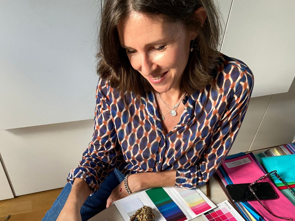
Hélène Baudrand
Pourquoi la couleur joue-t-elle un rôle si important dans nos collections ? La couleur est un élément unificateur en Inde, un pays aux paysages, croyances et peuples divers. La couleur rassemble les gens avec des émotions qui l'emportent sur toutes les différences.
Des fils d'or brillants entremêlés à des saris aux couleurs de l'arc-en-ciel, des nuances profondes de vert sur chaque brin d'herbe qui réagit à la luxuriante mousson de l'Assam, la brume montante qui ajoute du mystère à chaque lever de soleil, les îles changeantes du Brahmapoutre, le deuxième plus grand fleuve de l'Inde : ces couleurs et ces contrastes forment l'ADN de nos collections.
Le travail d'Hélène, experte parisienne en couleurs, nous fascine et nous inspire. Experte dans l'art de la colorimétrie, Hélène met de la couleur dans la vie des gens. Découvrez son parcours et sa passion ci-dessous :
Hélène, parlez-nous de votre parcours
Je suis experte en couleurs et colorimétrie. J'aide les femmes et les hommes à connaître les couleurs qui leur correspondent lors de rendez-vous privés.
J'interviens aussi auprès des entreprises pour les accompagner autour de leurs questions sur les couleurs, que ce soit du consulting, de la formation, du team-building, ou des animations de masterclass ou de talks.
Auparavant, j’ai accompagné des grandes marques de luxe pendant 20 ans dans leur communication au sein d’agences de publicité parisiennes, et j’ai été Rédactrice-en-Chef Adjointe pendant deux ans d’un magazine de mode, Please magazine, dont la direction artistique est ultra-colorée.

@nos.renaissances
Comment la couleur est-elle arrivée dans votre vie ?
Il y avait quelques artistes dans ma famille. Mais cet art pictural me semblait inaccessible. Et puis comme toutes les femmes, j'ai fait plein d'erreurs avec les couleurs. Pendant des années, je me suis fait un balayage blond doré sans comprendre que cela me donnait mauvaise mine. J'ai passé 15 ans à me dire que je manquais d'éclat, jusqu'à ce que je découvre que j'étais Hiver en colorimétrie. J'ai arrêté les balayages, retrouvé mon châtain cendré, et un teint frais.
Comment établissez-vous la colorimétrie d’une personne ?
Les couleurs sont des énergies : quand on porte des couleurs en harmonie avec celles de notre visage, on renforce notre énergie. Je pars donc des couleurs naturelles de la personne. Je peins les couleurs de son visage, puis je complète avec les couleurs qui s’harmonisent, grâce à la technique du draping. C'est un processus collaboratif.
Quelle est l’importance de la couleur en décoration intérieure ?
Elle est essentielle. Si on considère que sa maison est une extension de soi, il faut qu'on s'y sente bien. La question n'est pas "la couleur est-elle importante ?" mais "quelles couleurs choisir ?"
Comment imaginez-vous la couleur d’une pièce ?
Moins une pièce est intéressante, plus elle a besoin de couleurs pour lui donner de la personnalité. Il faut un équilibre de couleurs chaudes et froides pour un intérieur vivant et harmonieux.
Comment accordez-vous la couleur d’une pièce avec des textiles ?
Je recherche l'harmonie. On peut créer des harmonies complémentaires, analogues ou utiliser la couleur des textiles comme ponctuation. Tout dépend de ce qu'on aime. Les textiles sont une façon ludique et efficace d'amener de la couleur.
Quelle est la première règle couleur pour décorer ?
Tout part de soi. Avoir un fil directeur, une palette cohérente pour que chaque pièce amène naturellement à la suivante est essentiel. Cela agrandit l'espace et donne du chic.
@nos.renaissances
Votre couleur préférée chez Jamini ?
J'en ai deux : le vert sapin et le rose froid intense. Bien se connaître et connaître ses couleurs permet de tout harmoniser, même en déco. Les couleurs chez Jamini ont du caractère et donnent de la personnalité à la décoration.
Plus d'inspiration sur nos produits faits main sur notre site.