Les associations couleurs d’Hélène, experte en harmonie chromatique
.png)
Les associations couleurs d’Hélène, experte en harmonie chromatique
Quelles sont les couleurs phares de la saison et comment les associer pour créer une ambiance équilibrée et vibrante ?
Pour répondre à ces questions, nous avons fait appel à Hélène, styliste couleur et experte en colorimétrie intuitive.
Pour Hélène (@nos.renaissances) chaque couleur raconte une histoire. Elle soigne, elle émeut, elle structure un espace. Sa vision ? La color thérapie comme outil d’expression personnelle, mais aussi comme un levier puissant pour sublimer nos intérieurs.
À nos côtés lors de notre dernier voyage en Inde avec les femmes formidables, elle a exploré les nuances du Rajasthan comme on explore une langue vivante. Ce voyage a nourri ses réflexions sur la couleur comme vecteur d’émotion et de lien, en résonance avec notre univers
Découvrez ses associations couleurs préférées pour le printemps, ses astuces pour marier les teintes avec justesse, et ses conseils pour créer un intérieur qui fait du bien grâce à la magie des couleurs.
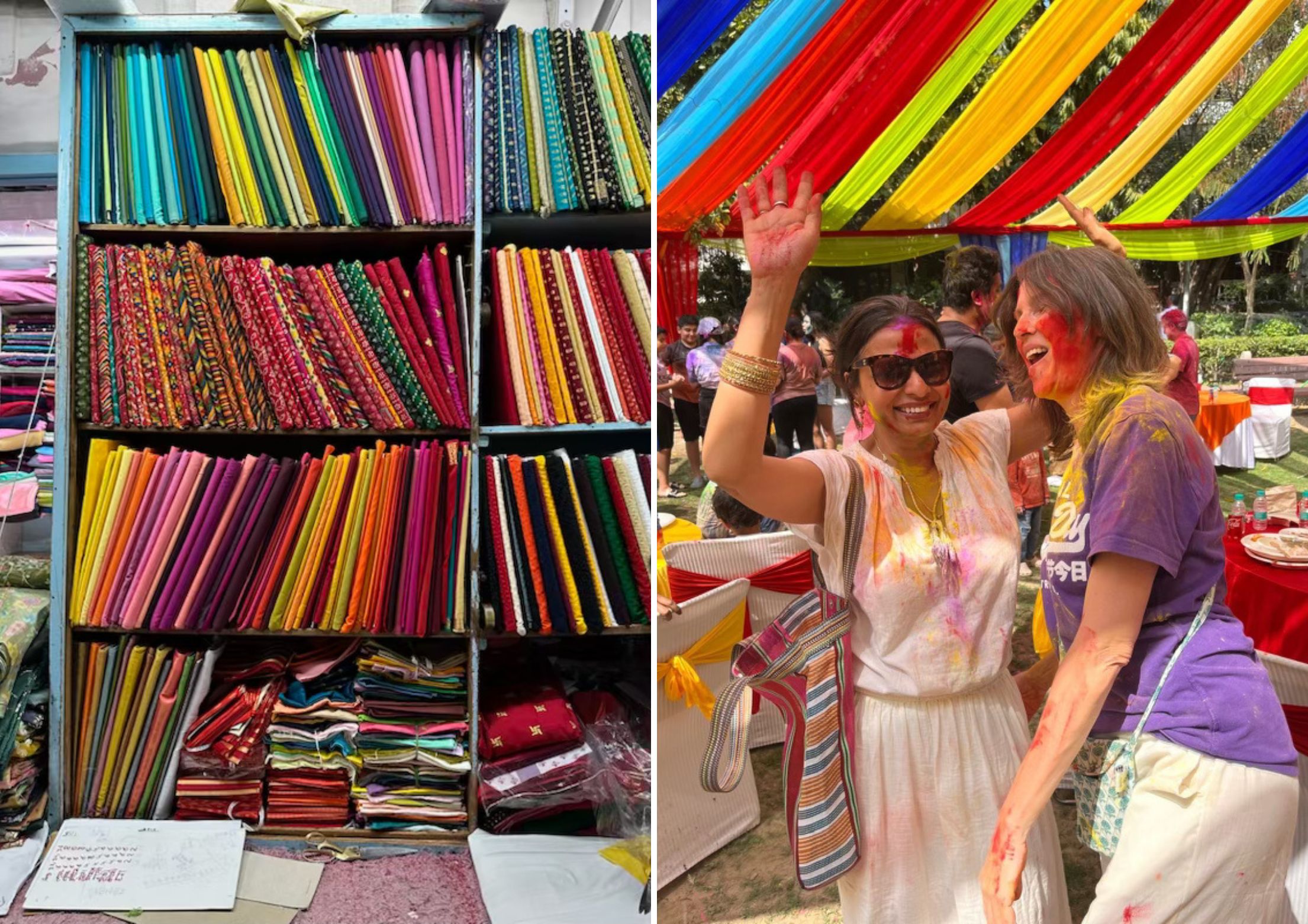
Usha et Hélène lors de notre voyage en Inde
Comment les couleurs influencent-elles l’atmosphère d’un intérieur ?
En décoration intérieure, les couleurs créent une atmosphère avant même qu’on ait conscience de ce que l’on ressent. Elles modulent l’espace autant que la lumière naturelle ou la disposition du mobilier. Psychologiquement, elles ancrent l’émotion d'une pièce : un rouge épicé réchauffe et stimule, un bleu profond calme et recentre, un vert doux apaise et régénère. Les tons chauds réchauffent l’espace et invitent à la convivialité, tandis que les tons froids apportent sérénité et structure.
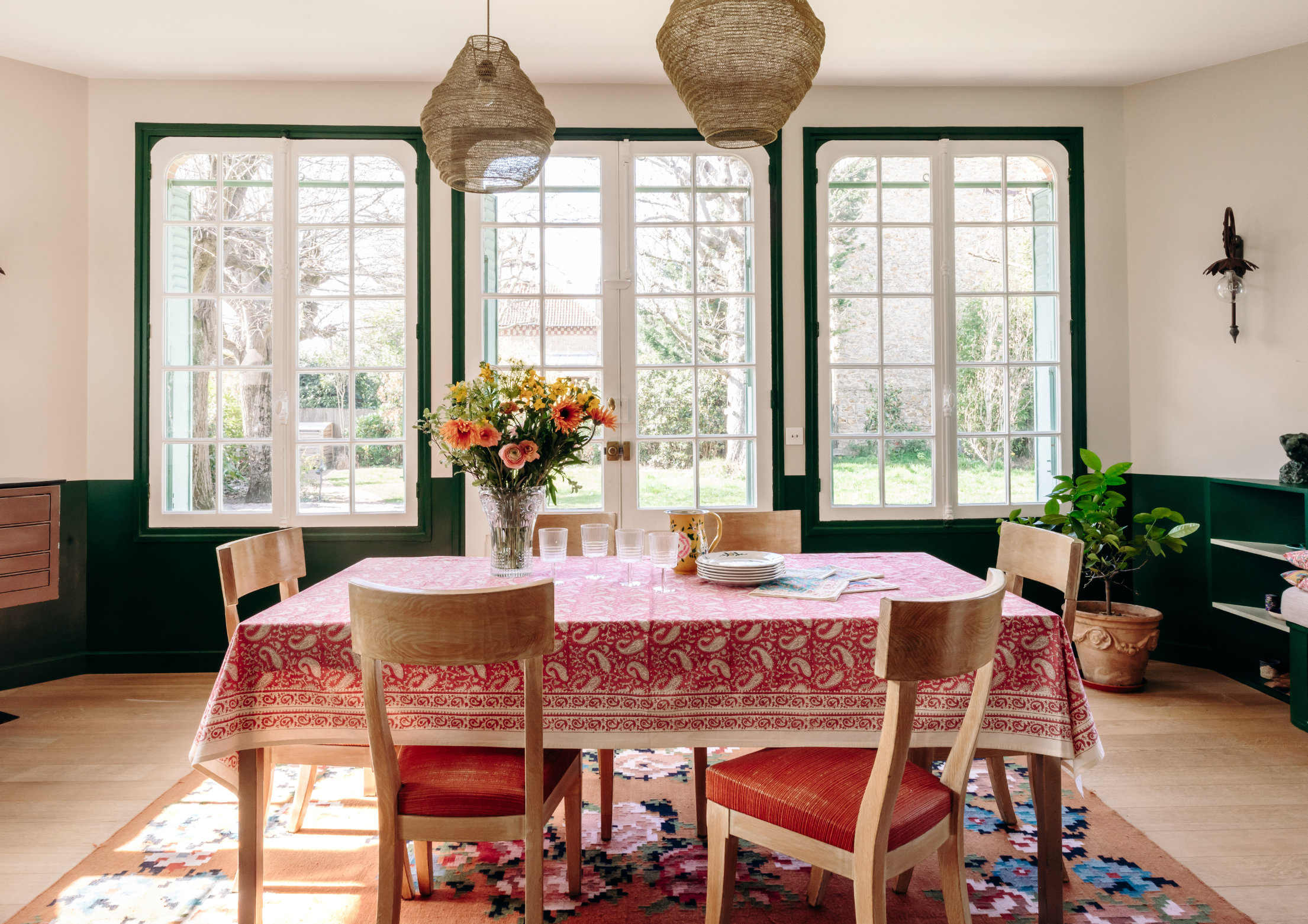
Culturellement, certaines teintes renvoient à des univers : le bleu Majorelle évoque le Maroc, un jaune safran transporte en Inde. Aujourd'hui, après des années de neutralité scandinave, on revient vers des intérieurs plus colorés, plus habités, où la couleur raconte une histoire sensible et personnelle. L’univers de Jamini illustre parfaitement ce mouvement : celui d’un retour à la maison expressive et chaleureuse.
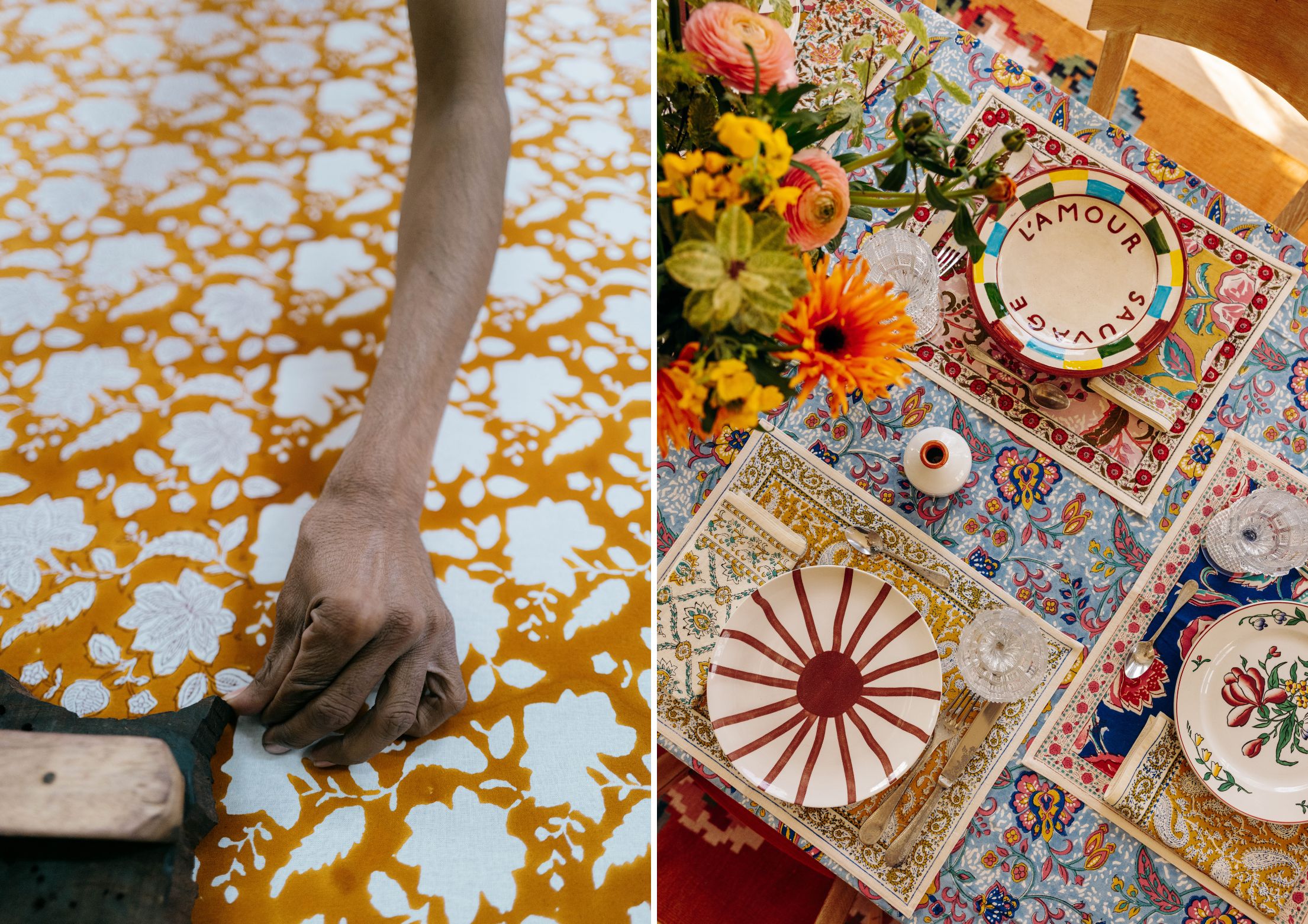
© Sophie Denux – Linge de table Jamini
Quelles sont tes nuances préférées dans notre nouvelle collection printemps/été ?
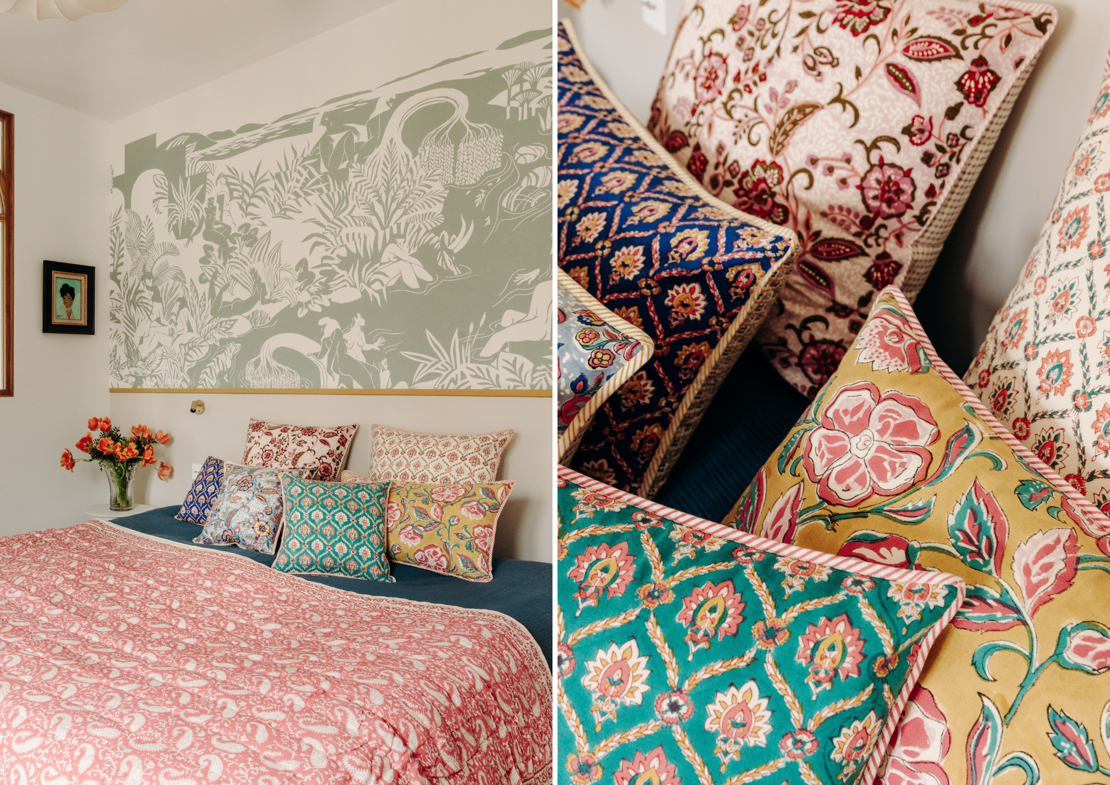
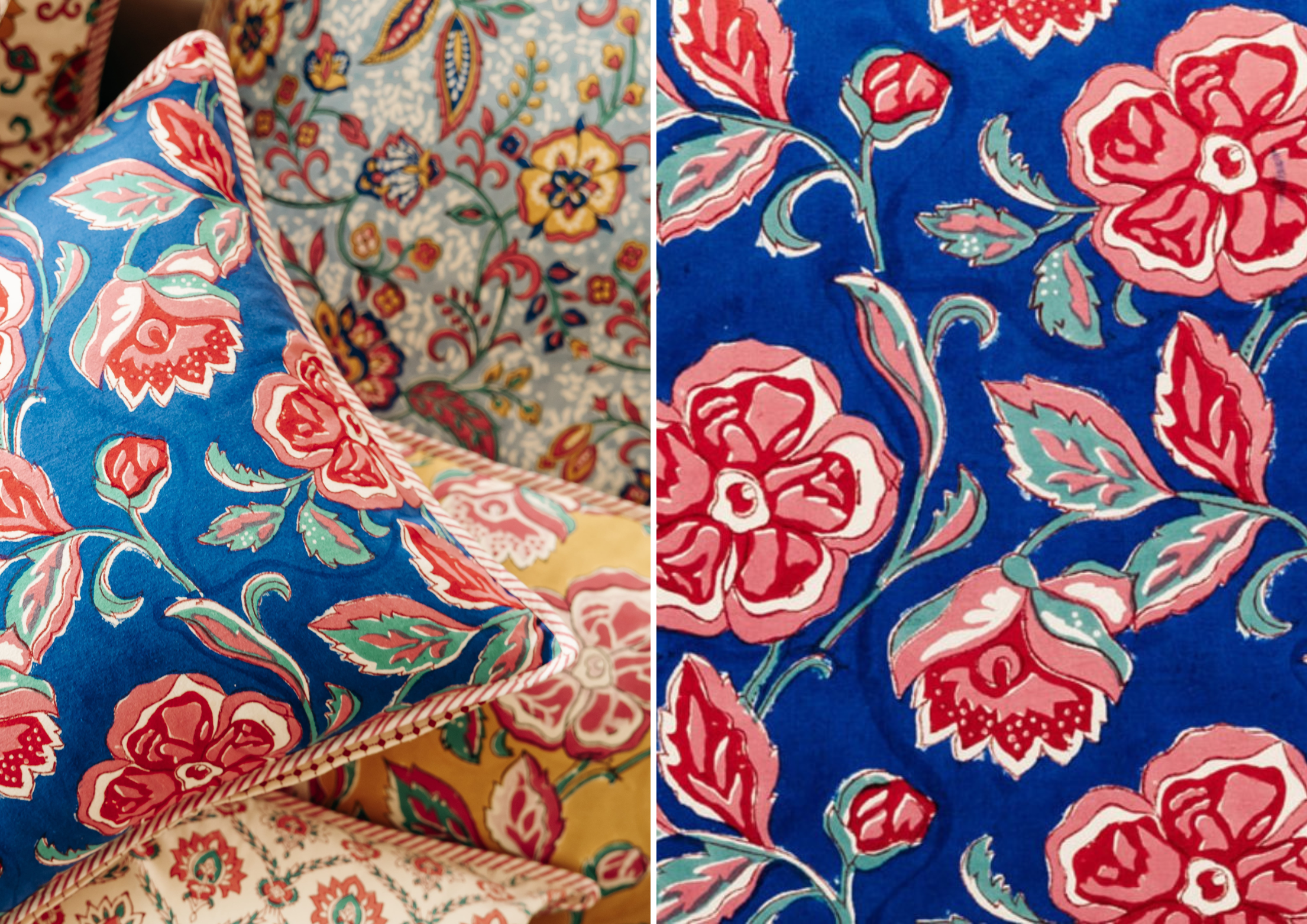
J’adore les déclinaisons de rouges épicés, de verts d’eau légèrement fanés et de ce bleu vif associé au rose. Le rouge, chez Jamini, n’est jamais agressif : il est charnel, inspiré des pigments végétaux anciens. Le vert doux équilibre la chaleur du rouge et amène de la fraîcheur. Et le bleu, vibrant et vivant, vient ancrer la collection dans quelque chose de plus grand que soi, presque spirituel. Associé au rose, il vibre encore plus, et donne un sentiment vivant et frais à la fois. Ces nuances évoquent pour moi la poésie d'un jardin indien au printemps, entre luxuriance et douceur.
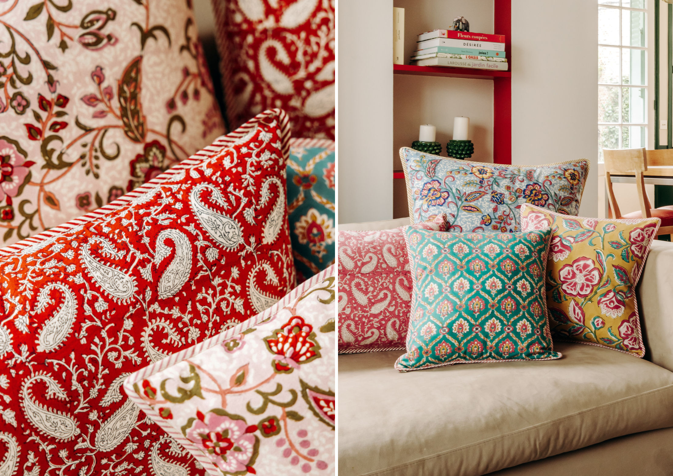
Coussin Paisley rouge – Coussin Luna vert pâle
Qu’évoque le bleu nuit pour toi ?
Le bleu nuit est une couleur à la fois majestueuse et silencieuse. Historiquement, il fut la teinte des rois, des clercs et des grandes cérémonies, en raison de la rareté des pigments naturels capables de le produire. C’est aussi une teinte de transition entre le jour et la nuit, entre le visible et l’invisible, omniprésente dans les arts textiles traditionnels, notamment dans les tissus d’apparat. Il évoque pour moi l'infini, la profondeur rassurante de la nuit indienne, le silence et l’introspection. Psychologiquement, c’est une couleur qui invite au calme, à l’écoute intérieure.
Décorativement, il structure une pièce comme un mur porteur émotionnel : il donne de la profondeur, fait ressortir les autres couleurs, apporte du mystère sans jamais alourdir. Il structure l’espace et sa profondeur crée une atmosphère enveloppante et intime. C’est une couleur qui invite à la contemplation, qui pose un décor sans l’écraser. Associé à des tons chauds comme le safran ou des matières précieuses comme le lin ou le velours, il crée une atmosphère de raffinement intemporel, où la lumière et l’ombre dialoguent avec délicatesse. Dans les tendances actuelles, le bleu nuit est revenu en force comme alternative sophistiquée au noir, dans des intérieurs bohèmes, méditerranéens ou contemporains.
Quelle sensation crée le misty rose dans une pièce ?
Le misty rose est un rose poudré, doux, qui insuffle une lumière tendre et délicate, presque onirique. Dans une pièce, il agit comme un voile qui adoucit tout : les angles deviennent moins saillants, l’atmosphère devient plus enveloppante. Psychologiquement, c’est une couleur de réconfort et de lien, associée au soin de soi et aux moments suspendus.
Culturellement, c’est une teinte qui évoque les soieries anciennes, les pétales de fleurs fanées, un raffinement presque tactile. Aujourd'hui, le misty rose s’inscrit dans la tendance des "neutres colorés" : des tons doux mais chargés de subtilité, parfaits pour créer des intérieurs élégants sans froideur.
S’il est chaud (tirant légèrement vers le pêche ou le beige rosé) il s'accorde bien avec des neutres chauds (beige sable, crème, camel clair), des verts doux et chauds (vert amande chaud), ou des dorés patinés, mais aussi des couleurs plus tranchées comme un corail vif, un orange brûlé, ou un jaune safran lumineux. S’il est froid (tirant vers un rose grisé, un rose bleuté), il est très élégant avec des neutres froids (gris perle, blanc neige, bleu-gris), des verts froids (sauge froide, vert-de-gris) ou des métaux froids (argent brossé, nickel). Si on veut le réveiller un peu il se marie bien avec un bleu canard, un vert émeraude froid, ou un violet prune. D’une façon générale, il est très beau aussi avec des bleus doux ou des rouges patinés, pour créer une harmonie délicate, lumineuse et enveloppante. Bref c’est une couleur polyvalente qui se marie avec beaucoup de couleurs.
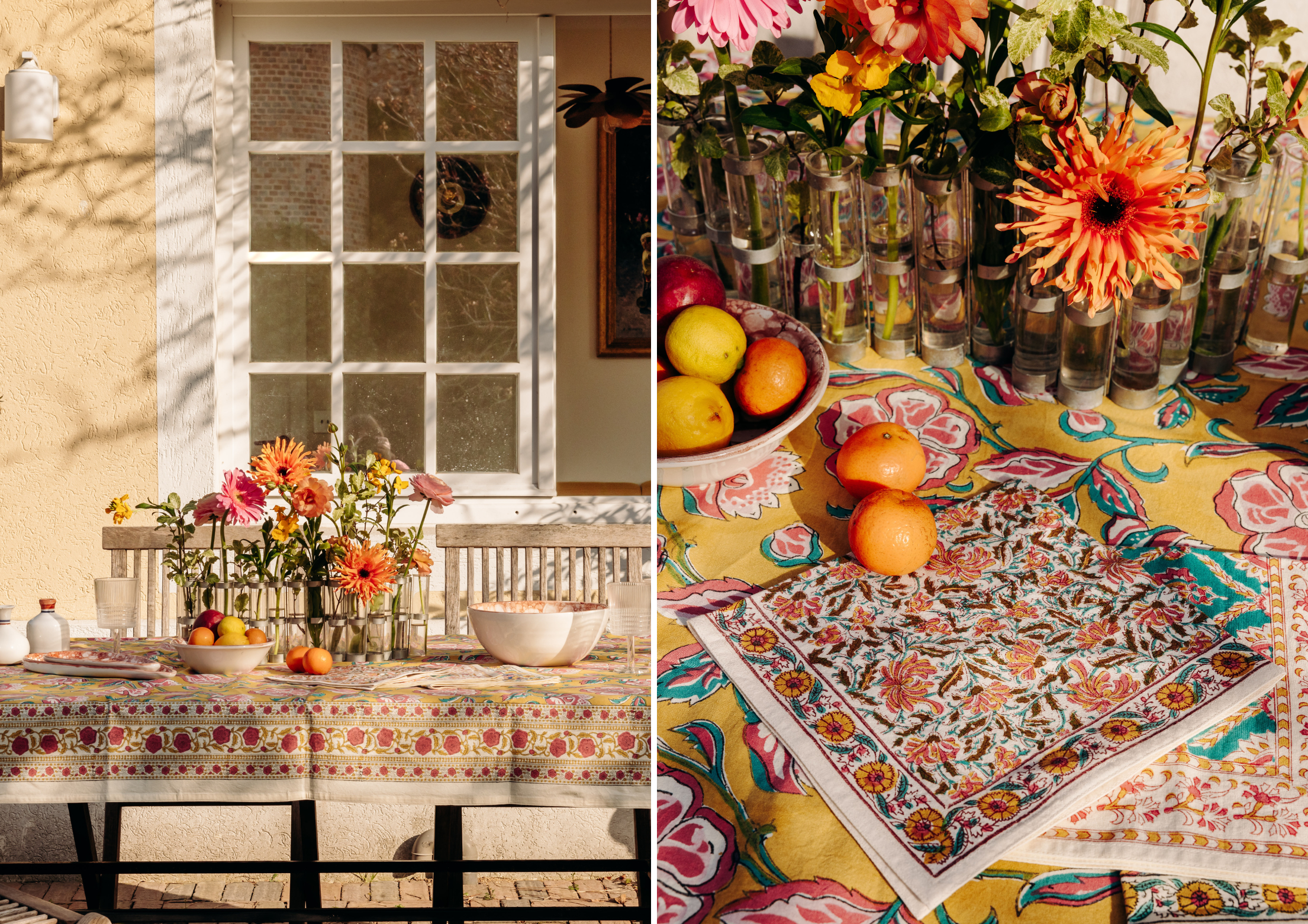
Comment décrirais-tu le jaune safran et son effet sur l’ambiance ?
Le jaune safran, est un jaune chaud, lumineux, moyennement clair et saturé, vibrant entre l'énergie solaire du printemps et la richesse épicée de l'automne, avec une profondeur terrienne. En décoration, il insuffle une énergie joyeuse et exotique. Il évoque immédiatement la richesse des cultures orientales, les épices, la lumière ocre des fins de journée chaudes. Psychologiquement, il stimule l’optimisme et la créativité, dynamisant sans jamais fatiguer. Dans les tendances actuelles, c’est l’une des couleurs fétiches du design bohème chic : parfaite en accent pour réchauffer une palette plus neutre ou pour créer des contrastes doux avec des verts sauge, des bleus sourds ou des blancs cassés.
Quelles couleurs adopter pour le printemps ? Et comment les associer entre elles ?
Les tendances actuelles privilégient des associations vivantes mais pas criardes : un vert d’eau avec un jaune safran pour un contraste lumière/nature, un bleu profond avec un rose poudré pour un effet jour/nuit, un rouge épicé tempéré par un beige sable pour garder la chaleur tout en restant élégant.
L’essentiel est d'oser mélanger les vibrations colorées tout en gardant une cohérence émotionnelle. Parce que le printemps, c’est avant tout la saison du renouveau, de la lumière et de la gaieté. C’est le moment où le soleil revient, où l’on ressent cette envie instinctive de fraîcheur et de vitalité. C’est aussi une période parfaite pour s’écouter et se laisser guider par ce qui nous met en joie : que ce soit des couleurs vives et éclatantes ou des nuances plus assourdies et douces, des teintes chaudes qui réchauffent ou des froides qui apaisent.
Il n’y a pas de règle unique : il y a une envie intérieure à suivre. Pour les associations, je conseillerais de rester libre : marier des verts tendres à des roses fanés, dynamiser un bleu doux avec une touche de jaune safran, ou créer un dialogue entre un rouge chaleureux et un beige lumineux. L’important est que la palette raconte votre propre printemps intérieur !